Eclipse
Introduction
Eclipse is a design fiction project in which we imagined a dark dystopian future doomed by overpopulation and famine. A state cult has emerged, slowly inciting people to volontarily sacrifice themselves in order to leave room for others. Doing this grants you a peaceful afterlife, and directly helps your relatives.
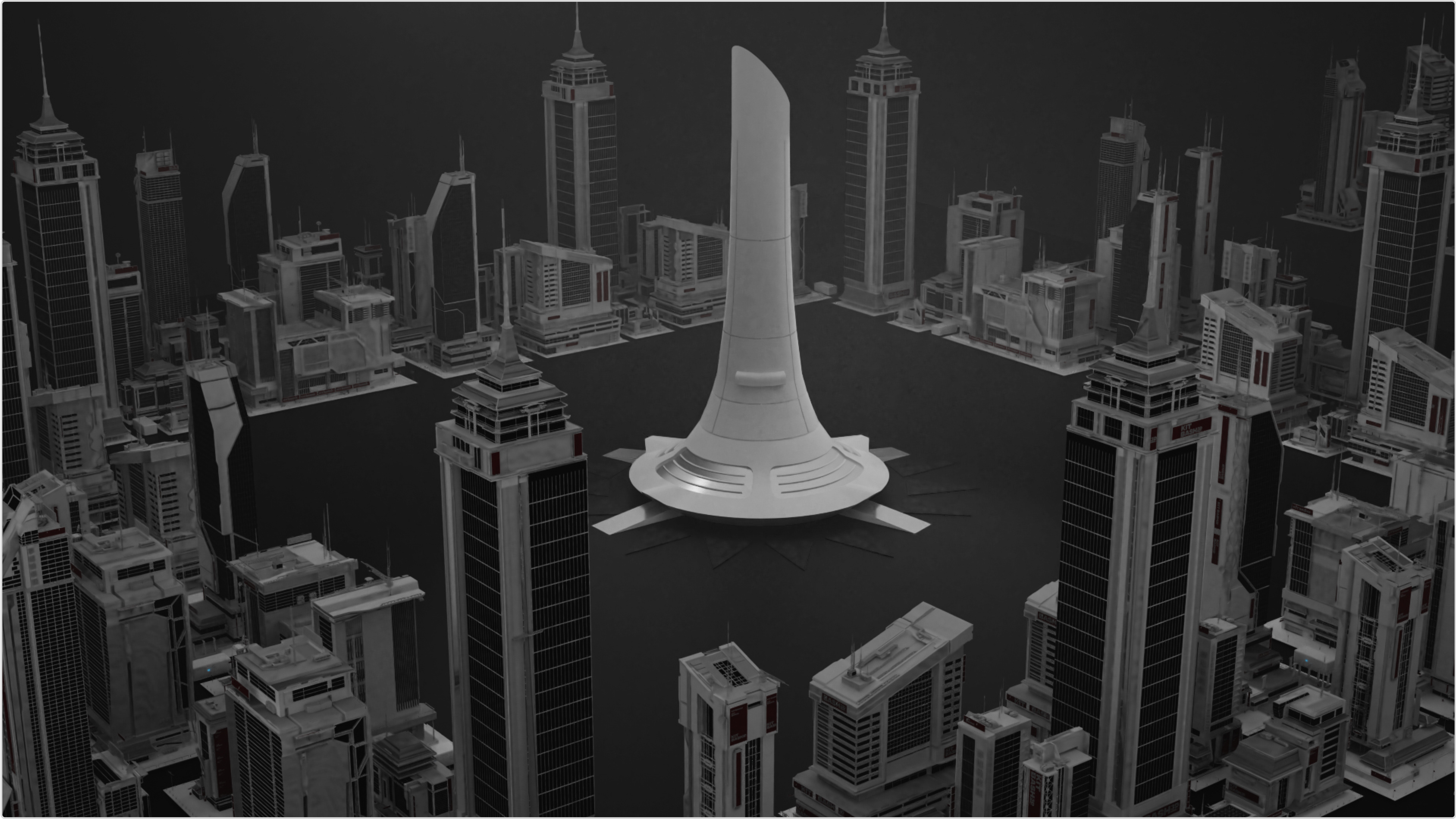
We imagined this cult inventing a kind of capsule allowing anyone to perform assisted suicide easily and painlessly. These capsules would be implanted in various locations across the city, and would directly cremate their users and store their ashes in nominative urns, displayed in commemorative towers. This system is designed to grant your family a sum of money varying on your age or health condition.
This project obviously refers to the present ethical questions regarding assisted suicide, and volontarily exaggerates the context to draw attention on this matter. It is however very plausible that a device like this would exist in the near future.
As of December 2021, it now exists ! Not thanks to us, but still... Read here
CATEGORY
Graphic Design, Branding, Design Fiction
ROLE
Lead Designer, Art Director, Project Manager
BRIEF
Design a future world and a product that would answer one of this world's problems, drawing a connection to current questions in our time and age.
World building & sketches
We started by creating our world from scratch, and were inspired by several sci-fi movies or novels. We wanted to do something really impactful, so we designed this pessimistic view of our future, laying the bricks for drastic solutions, and allowing us to get really creative.
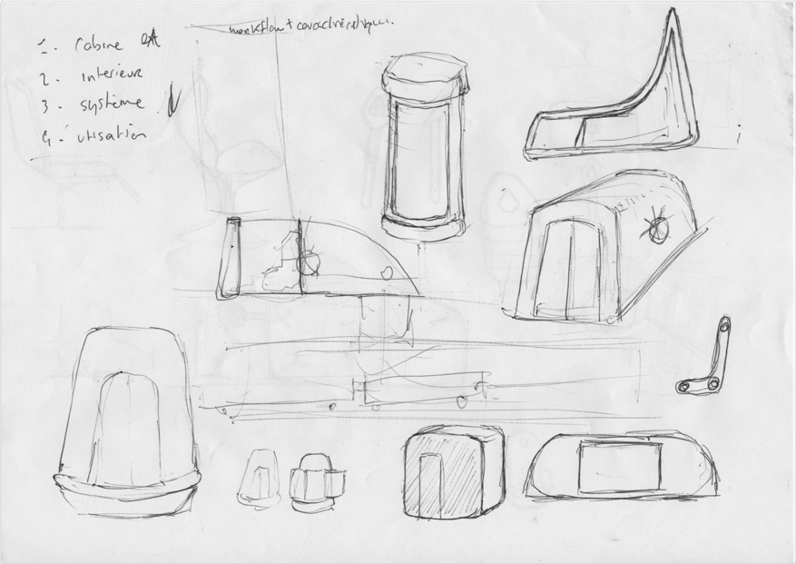
I started by writing short stories taking place in this universe, highlighting the day to day life and problems that everyone was facing. We soon knew what direction it would take so once the stories were finished, we detailed our idea of an assisted suicide cabin, and started drawing sketches.
Branding
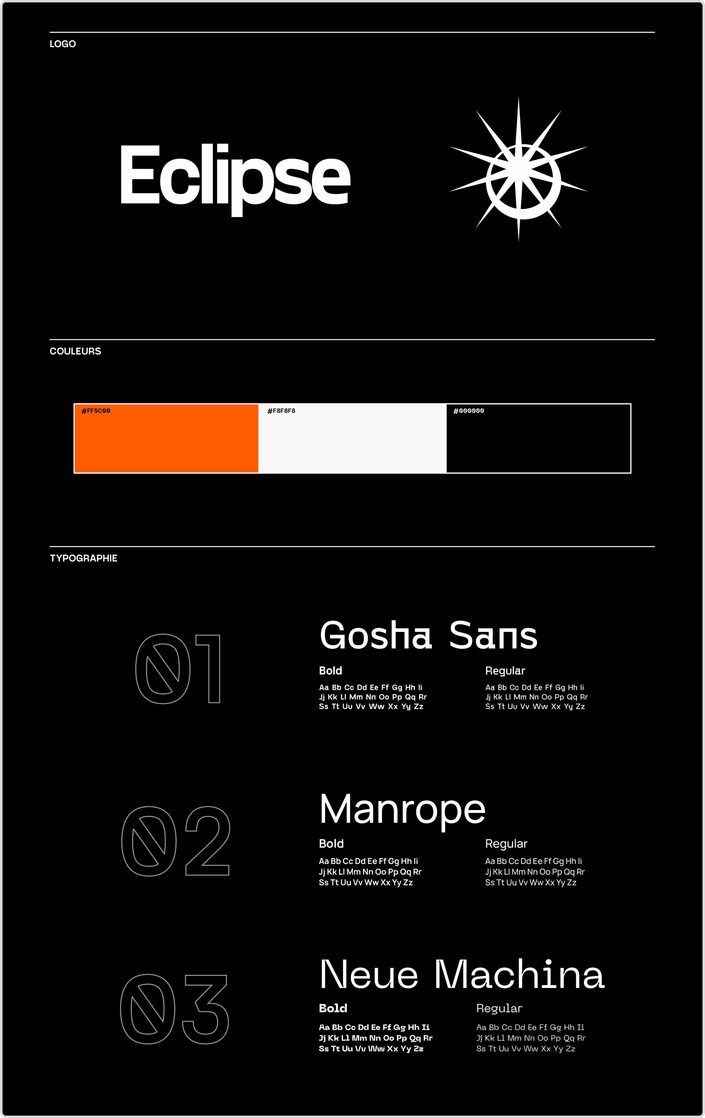
For our brand, we needed a strong yet simple branding, with a simple symbol everyone could understand and get behind. The logo simply stands for a sun partially hidden by the moon, but still visible, hinting that the light is never really turned off, which holds a greater meaning about life. The eclipse wants to induce that our life on earth is just a step, and death is nothing more than reaching another state. Just a blink in our consciousness. All of this obviously in order to make death more desirable and achieve the goal of reducing population.
We also chose colors and several fonts for our different supports, and providing a coherent artistic direction for the team to work with.
Workflow
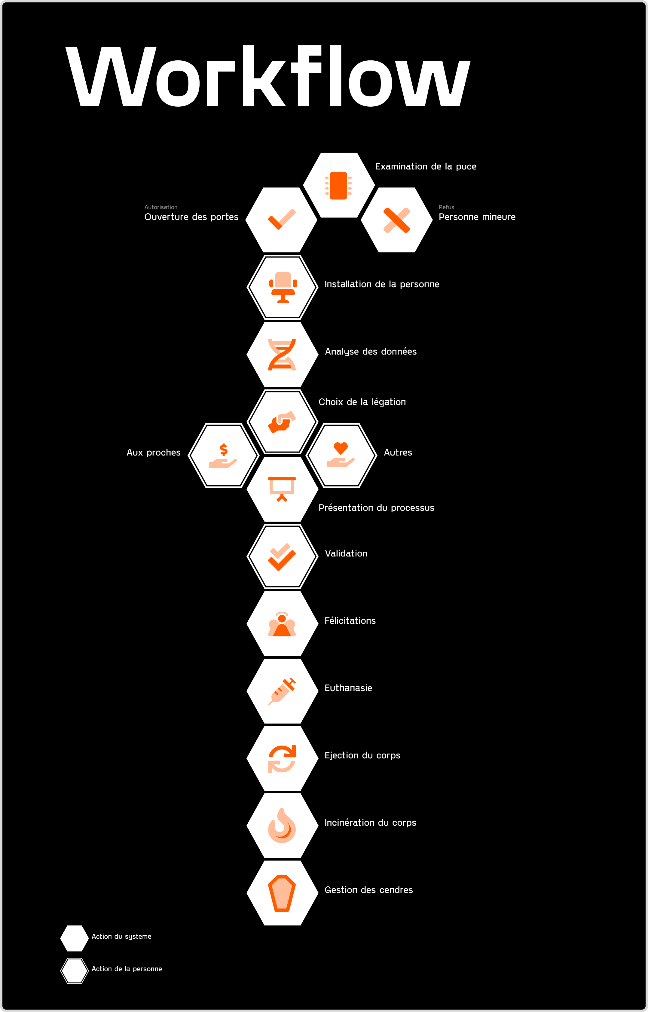
We then designed the workflow of the product, what steps a user would take to go through the whole process.
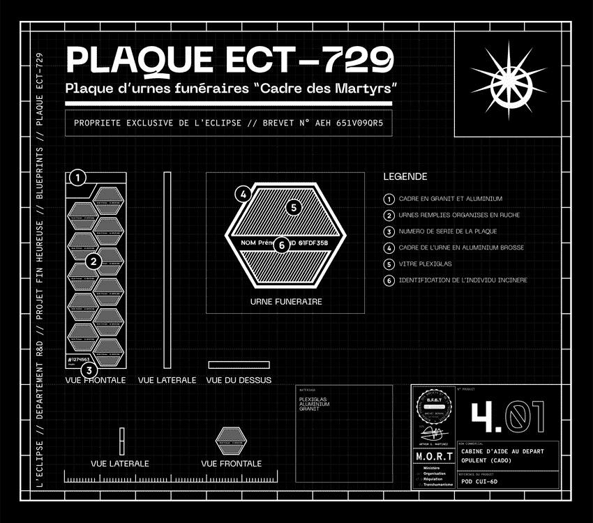
Blueprints
The next step was to specify how every parts of our product would work with each other and how the system looks as a whole. We designed several blueprints displaying all the elements, their parts and materials, and how the system works.
User guide
The rest of the process is detailed in the user guide and goes through all the steps, decribes every part and their dimensions.
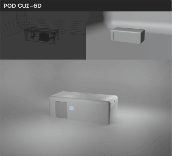
3D
With all the views, dimensions and sketches created, we only needed to create them in 3D models (credit: Inès Richard).
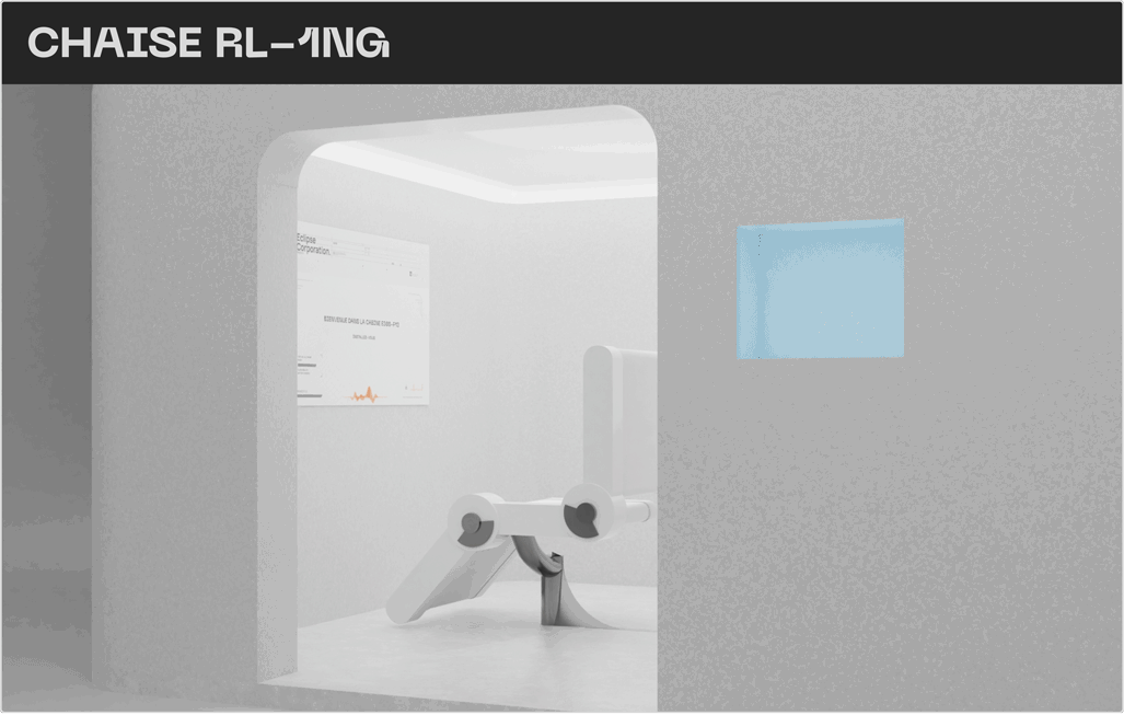
3D
Other views of the wonderful 3D renders of the product, and of the commemorative towers.
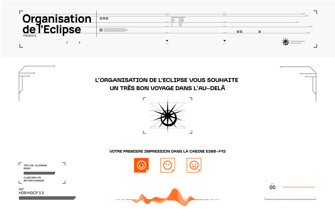
Cabin interface
A simple layout guiding the users though the process, and letting them choose who will receive the donation for their sacrifice.
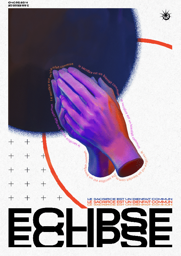
Posters
We imagined a communication campaign with animated holographic posters and strong ideological messages such as this one.
Video
A short video displaying the product in different views and displaying all its components and features.