Selfer
Introduction
Selfer is a CMS allowing the user to build static web pages and put them online without ever having to write a line of code.
It uses the Notion API to pull text and images from a chosen Notion Workspace, and lets the user style it - fonts, colors, and many more features that are in developement for future updates.
It is mainly aimed at students trying to put their work online on a personal page, or to upload a project within its own page. It can be used for events, restaurants menus, or simply giving your dog its own website.
It was built as a one-week long school project, and we ended up with an alpha version. This project is still in active developement, and many more things are scheduled, including other uses for this product, as well as a mobile version.
CATEGORY
UX, UI, Branding
ROLE
Lead Designer
BRIEF
Design and create a React/Typescript App in one week. We chose to create a basic CMS based on Notion for students and people with no intention to code or create a design in a builder, which still requires some skills.
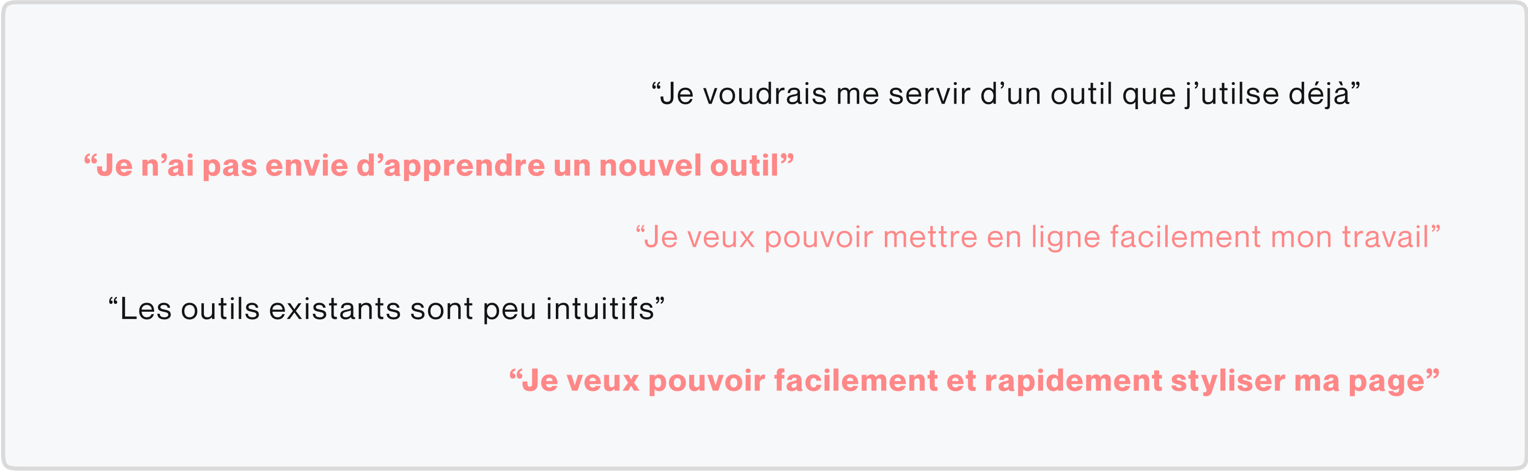
User Research
This product was originally designed with students as main users. Busy students, who can't spare any time to learn yet another set of skills and want to publish their work quickly, without the hassle of it being reliant on social media to exist.
Sometimes, for a school, a client, or a personal project, you absolutely need a standalone page, but you can’t afford the time to code it, or to use a complicated webpage builder.
Our observation was that a lot of the students we interviewed used some kind of software to take notes, and an increasing portion of them were using Notion, a powerful tool gaining more and more popularity for its efficiency.
Our goal was then to pull all the data from a given Notion page, allow the user to style it with a few clicks, and upload it, without ever becoming too technical or time consuming.
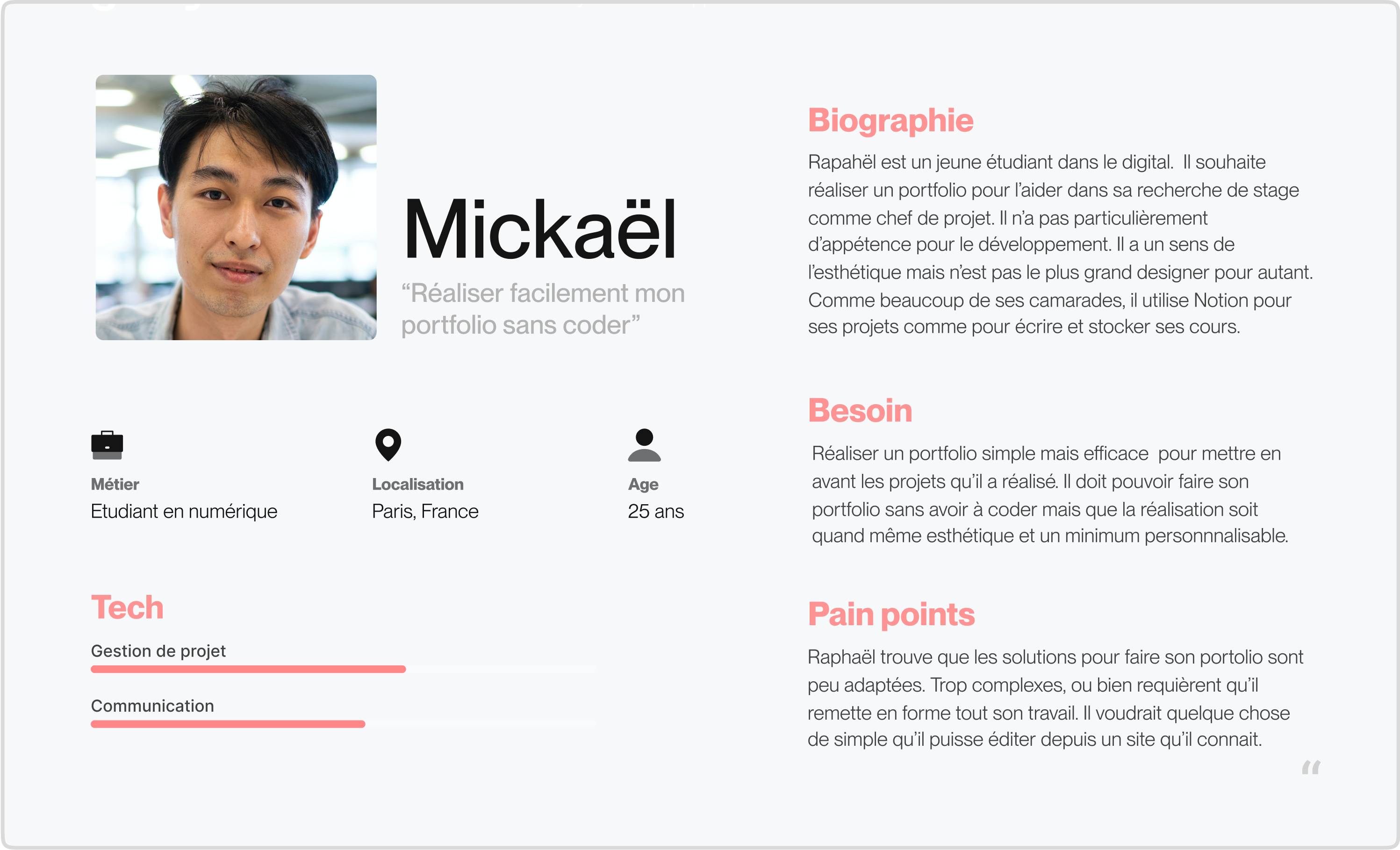
Persona
Based on our research, we knew out product needed to fulfill certain conditions in order to reach its audience. We then established a persona by making connections between all of these insights. Our target is a student whose main skill is project management, and he really can’t devote any of his time to learning new skills.
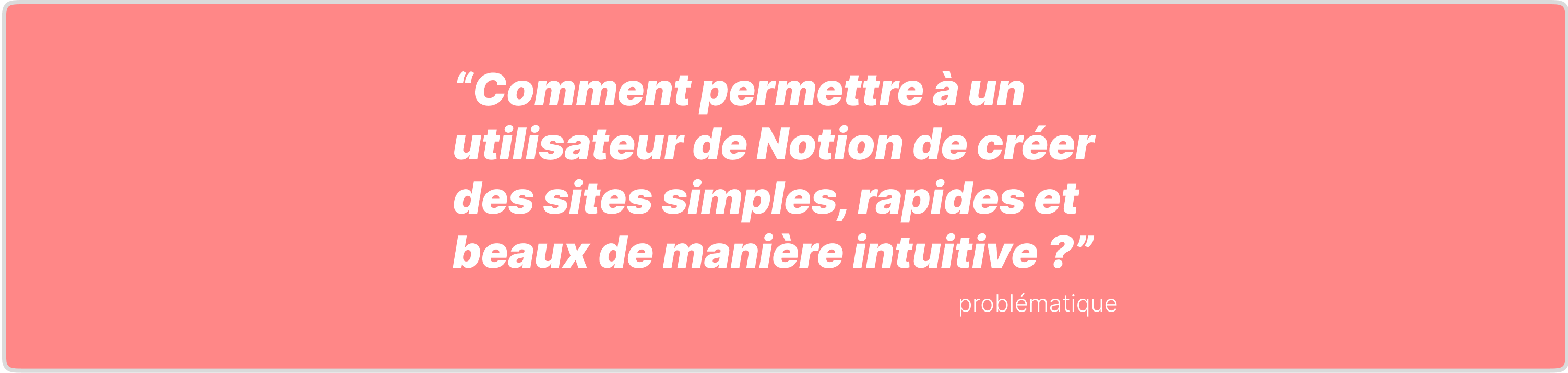
Problem
How to allow a user to quickly and intuitively upload simple, fast and beautiful websites using the content of a Notion page ?
Branding
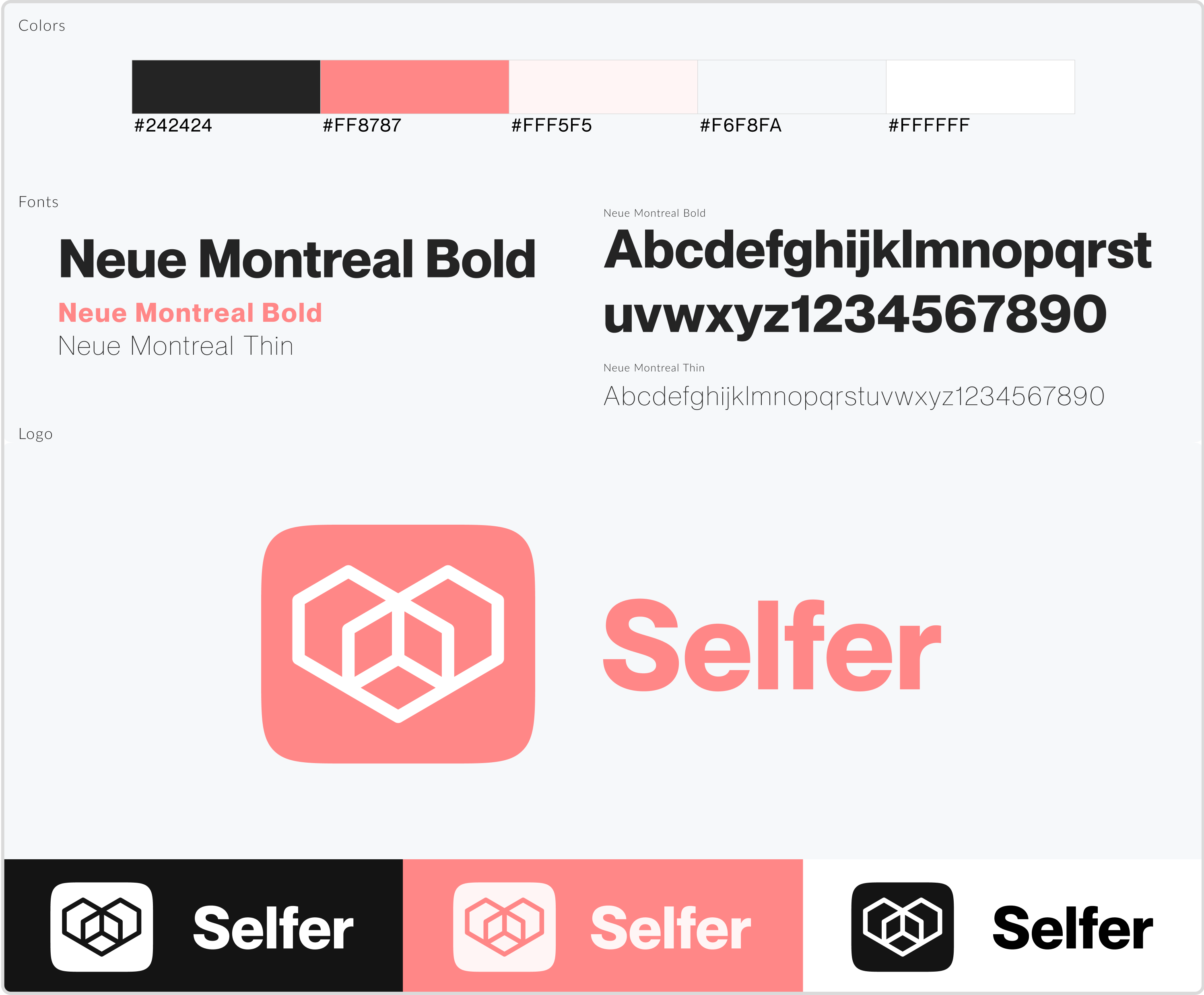
We had to build a whole brand identity for this product from logo making, to choosing elegant readable typography and non-invasive colors.
We settled with several font weights of the Neue Montreal typeface which is a great font for modern and catchy yet perfectly legible content.
As of colors, we opted for a lightly tainted white, to give a refined look to the whole product, and keep a certain neutrality so users aren’t too distracted by our own color palette when choosing their own colors.
Our accent color is a salmon pink that’s used scarcely in order once again not to distract the user too much.
The logo represents two boxes being connected together in order to form a pretty result. One of them stands for the Notion content, the other for the Selfer app, and the whole is your website, which obviously you love since you’ve made it.
The name was also chosen along this idea, Selfer standing for something self-made.
Navigation
Before we could go any further, we needed to select the core features of the app and create the userflow, to ensure a smooth and clear experience throughout the app, and also for us to stay focused on what needed to be done.
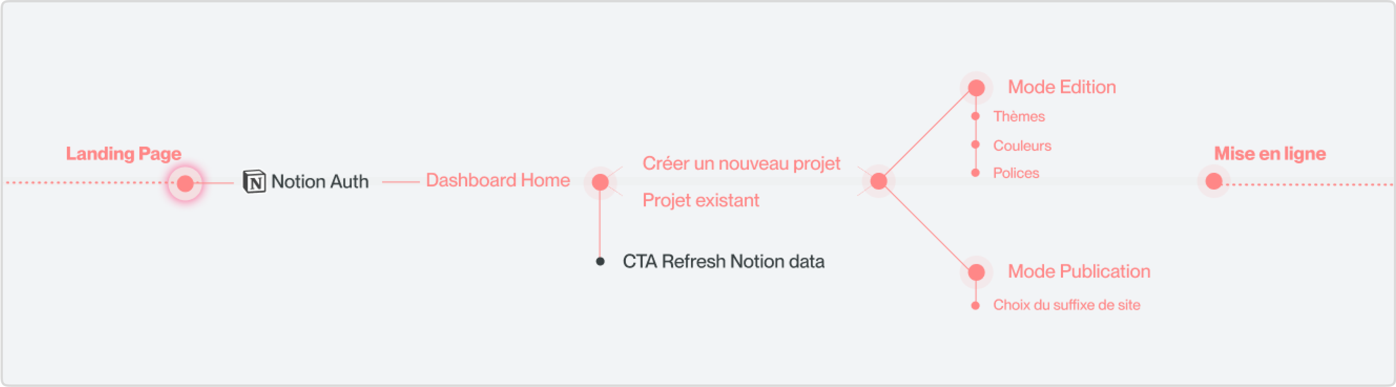
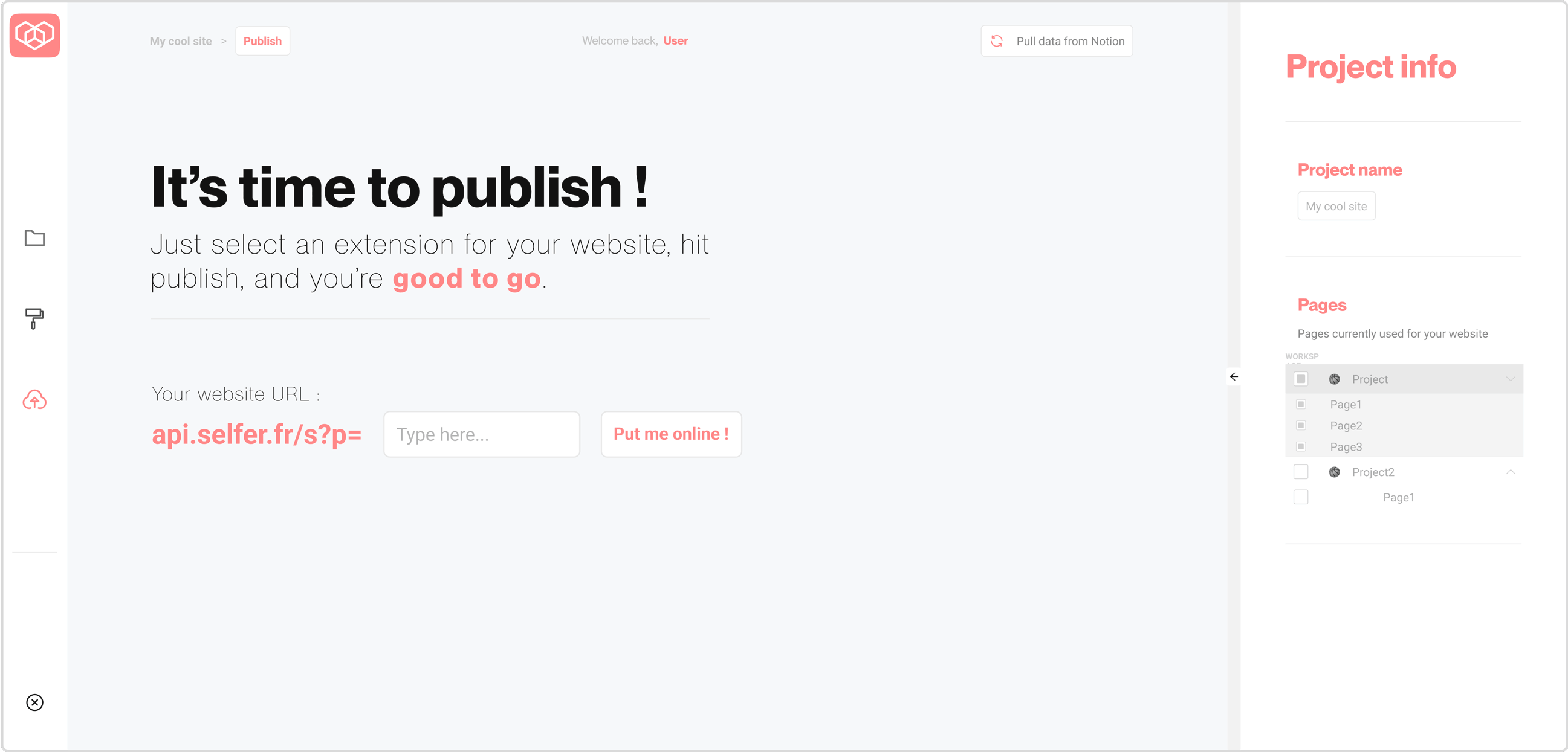
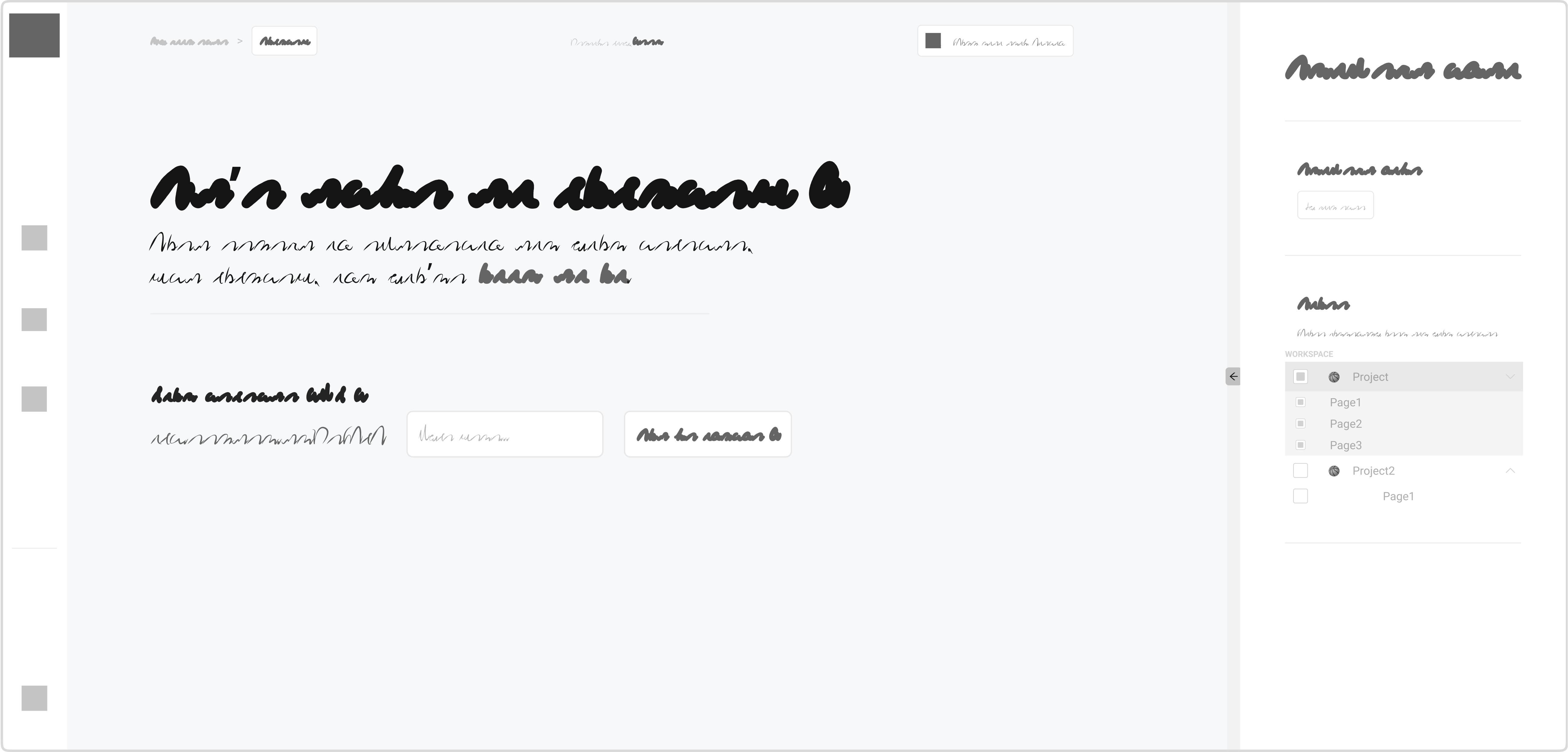
Layout
First we did some very basic wireframes to get the main layout of the app. Here we have the main 3 pages : Project selection, page edition, and website upload.
This layout is reminiscent of various design applications and will allow the user to understand faster what is going on.
The left panel will be dedicated to navigation between the three main steps of the product, and the right panel will be used to display relevant information about the active section.
Finally, the center area will be where content is displayed : choose a project in the list, edit a page, uploading your project.
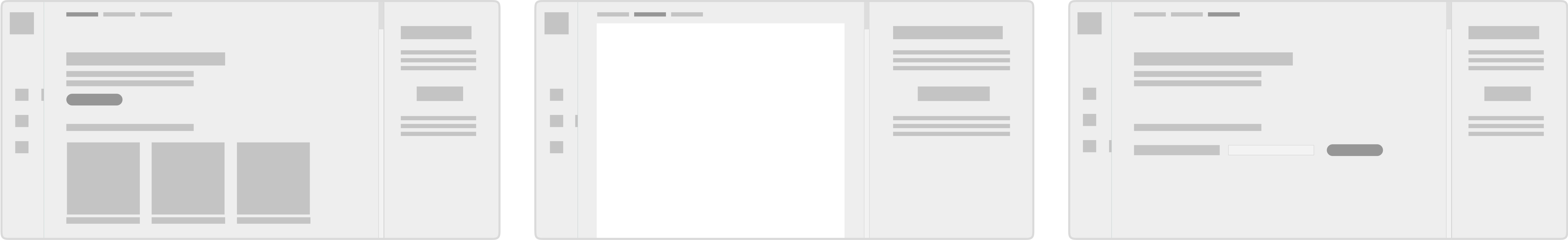
Wireframes
It was then time to produce a high fidelity wireframes, to test if this layout was able to display everything in a clear, concise and understandable way.
We knew the final product would be very simple in its aspect, that’s why we polished our wireframes so only a few UI elements would be changed, and this allowed us to take a shot at our first elements for our design system.
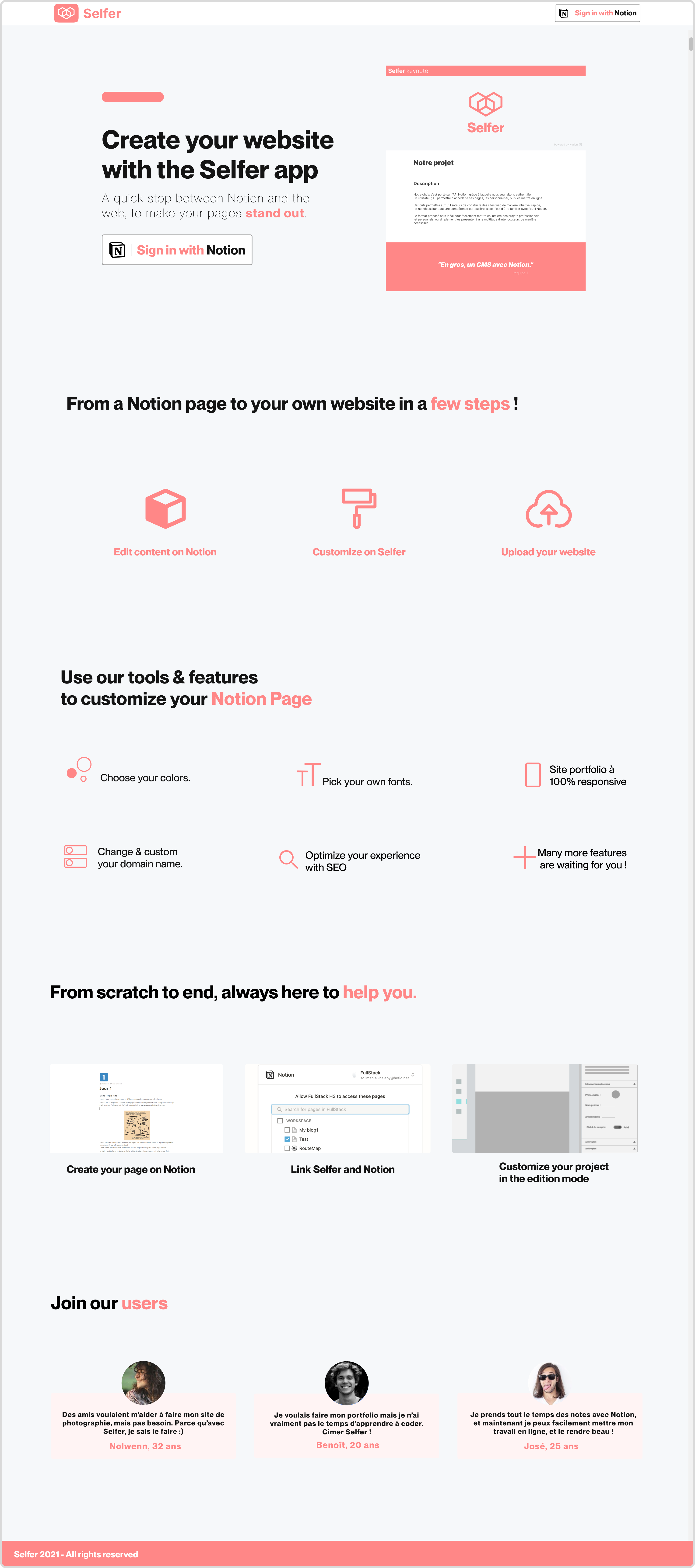
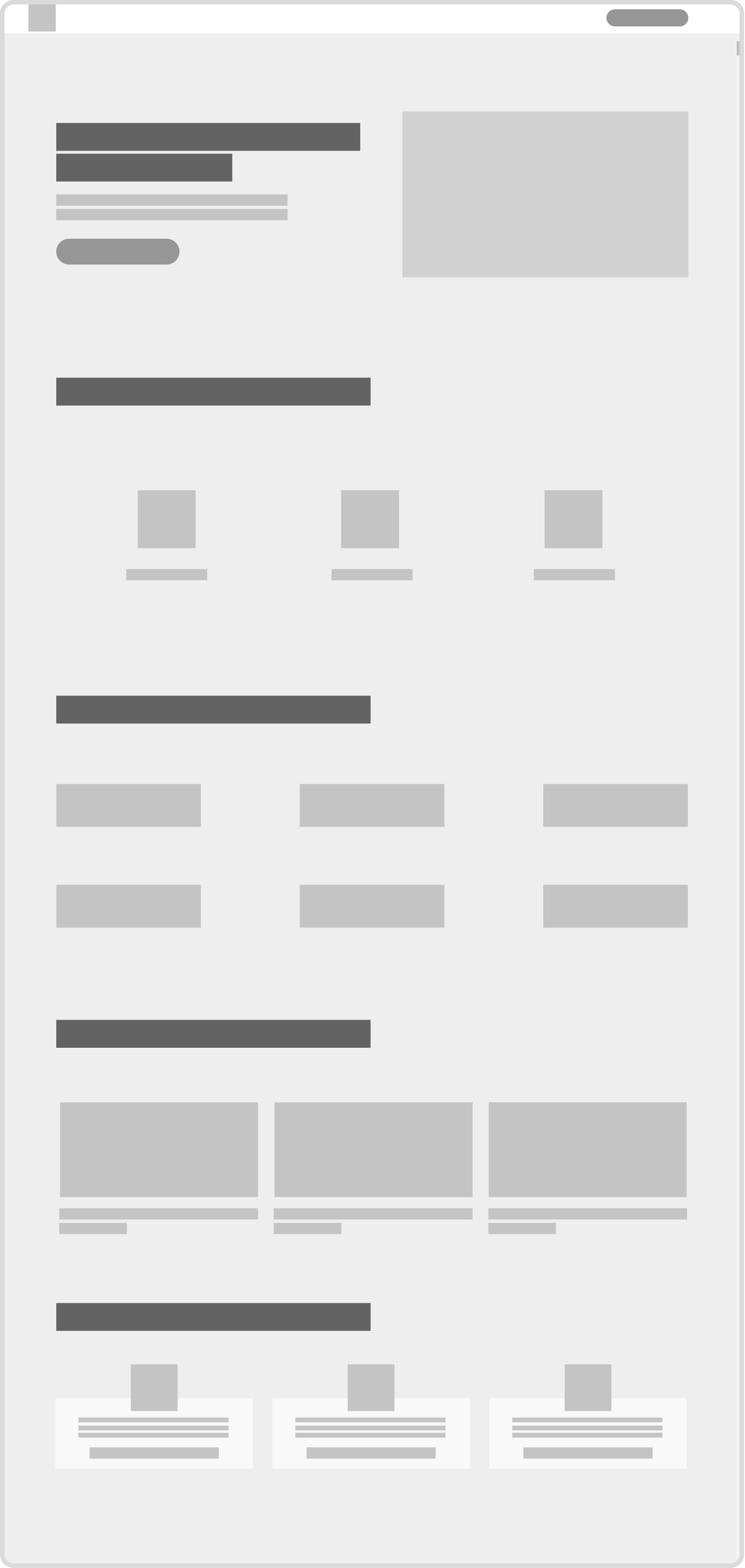
Landing page
We also needed a landing page so we could be visible in search engines, and to present our product before redirecting visitors to the webapp, granted they’ve clicked on the call-to-action.
This landing page was the opportunity to showcase what’s possible with our product, so we decided to go for something basic, that could easily be replicated within Notion.
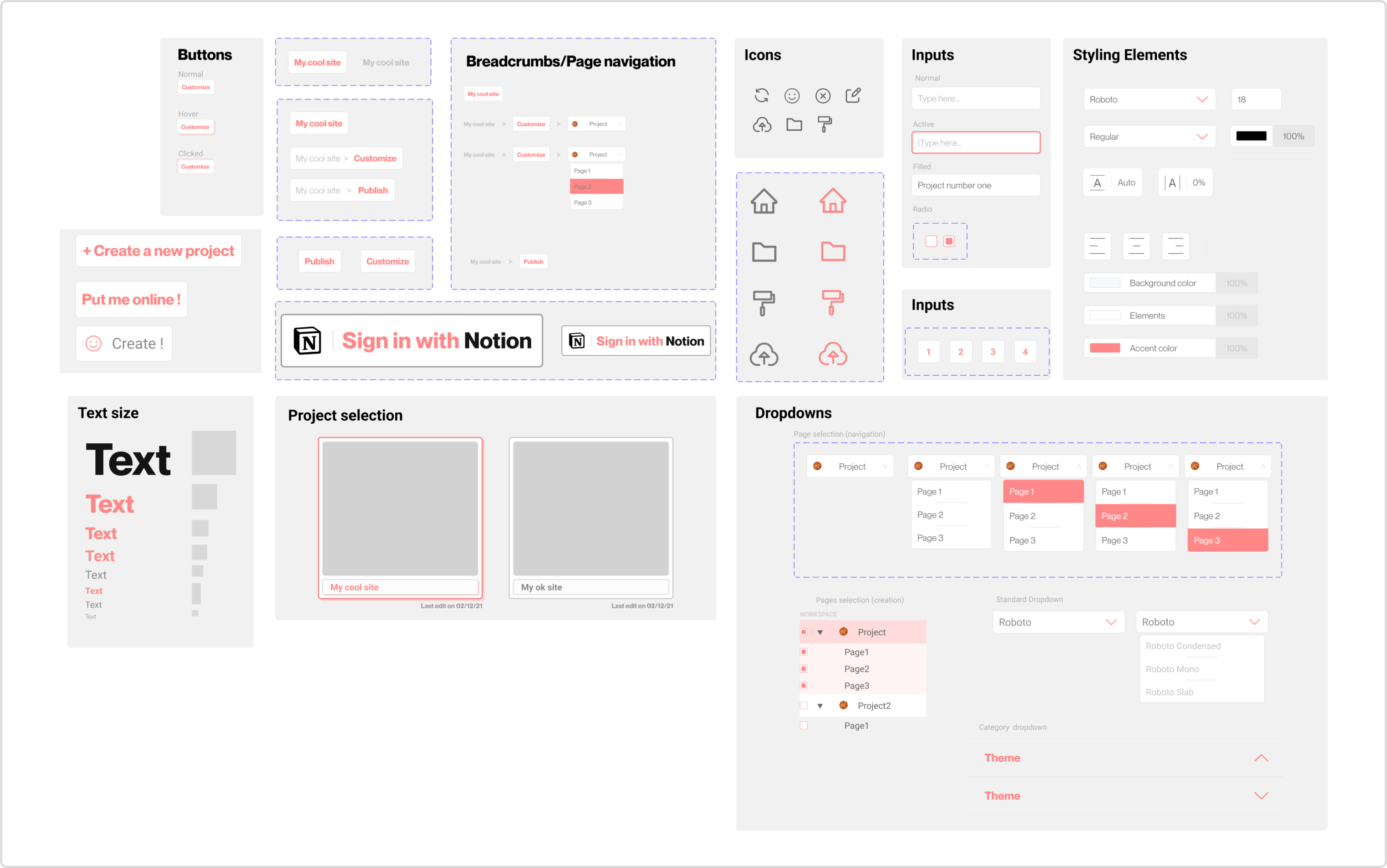
Design system
We then started building a design system in order to have all the components we needed for a coherent and pleasant user experience, and a great basis for future updates. Proceeding this way also allows for better processes within the front-end team, and ensures that the brand identity is thoroughly respected. Variants were also used
Screens
With everything at our disposal, building the finished screens war pretty straightforward. The finished product is still in alpha developement, so we will be adding more to this case study as it advances.
Our next step, design wise, is to add all the micro-interactions, as well as a full onboarding for new users, so expect this in a future update.